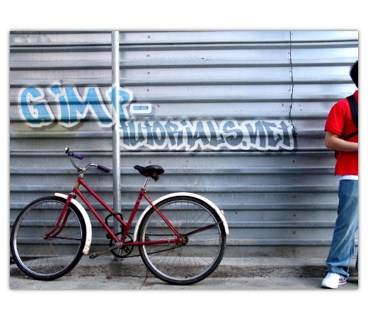
Today we are going to create some realistic graffiti in the Gimp. This tutorial is partially inspired off of Photoshop tutorial by DreamDealer v5.0 at DreamDealer.nl Let’s get started! If you need the updated .dll file, please check in our DLL section.
Step 1
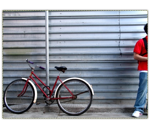
Download this photo and open up Gimp. Open up the photo we just downloaded. Go to Select > All, copy & paste onto a new layer. Delete the original layer.

Step 2
Now you are going to need a type of logo. You can either create one or find one online somewhere. For the sake of the tutorial, I decided to create one. If you want to use one you found and not make one, then skip down to step something. If you’d like to make one, then read on.
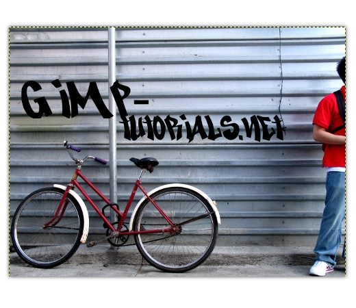
There are many ways you can go about making a logo/design for graffiti (at least digital graffiti anyway lol). For mine, I’m going to use text. Download this graffiti font and install it. Restart the Gimp (save first!) and open your document back up.
At this point, go ahead and use the Text Tool and type in whatever you want your graffiti to say. Position and size it. Don’t worry about the perspective right now. We will get to that later.

Step 3
I decided to add a little bit of a background and a stroke to the text. To do that, first merge the two text layers together. Rename the new layer as “text.” Create a new layer underneath this layer and name it “text_bg.” Right click on the text layer and select Alpha to Selection. Go to Select > Grow. Grow by 15 pixels. Fill the selection with white on the text_bg layer using the Bucket Fill tool.
Create a new layer above the text layer and name it “text_gradient.” Right click the text layer and select Alpha to Selection. Change the foreground color to #00a2ff and the background color to #383838. Select the Blend Tool and apply a gradient from top to bottom of the text on the text_gradient layer. Go to Select > Deselect.
Merge all the layers that make up the text logo. Go to Filters > Light and Shadow > Drop Shadow. Set the X & Y radii to 20 and the blur radius to 0. Uncheck allow resizing. Set the opacity to 70%. Hit ok. Merge the text with the shadow. Our logo is done.

Step 4
Select the Perspective Tool. Alter the perspective of the logo so that it matches that of the wall. Hit ok.

Step 5
Set the layer mode of the logo’s layer to Overlay.
At this point, the logo looks a little too sharp to be a logo. Let’s fix that. Duplicate the logo’s layer. Move the duplicate layer underneath the original text layer. Go to Filters > Blur > Gaussian Blur. Enter 30 for both values. Hit ok. Right click the original text layer and hit the Alpha to Selection option. Select the duplicate layer and hit the delete button.

Step 6
Use the eraser tool on both logo layers to erase the parts of the logo covering the pole.

Step 7
I decided the image needed another effect. Go to Edit > Copy Visible, and then go to Edit > Paste As > New Layer. On the new layer that just popped up, go to Filters > Blur > Gaussian Blur. Enter 10 for both values and hit ok. Set the Layer mode to Overlay.

Conclusion
There you have it. A simple way to create some graffiti. Just remember that you should never use a smooth wall- only textured/rough ones. Makes the effect more realistic.

