The past days I was looking a tutorial at Abduzeedo site, and got interested on Fabio Sasso new tutorial called Fiery Fireballs in Pixelmator and thought: Can I create fireball and explosion scene in Gimp.Yess! I can! So i decided to write tutorial and share how i making the fireball and explosion effect in Gimp.
I think this tutorial it for intermediate Gimp users, and assumes you have basic knowledge of layers mask and the tools available. You’ll learn how to transform a stock image – into a fireball and explosion scene. I hope u enjoy this one. Any feedback would be greatly appreciated!
For this project I will use a stockphoto from night-fate-stock at DeviantArt and a clouds brushby Javierzhx .
STEP 1
open the image in Gimp.

STEP 2
Adjust the brightness of the image.

STEP 3
Duplicate the image layer and change the layer mode to Overlay.

STEP 4
Create a new layer ( i’ll name this one as black explosion), select black for the color and pick the Paint Brush Tool.
Using the Javierzhx clouds brush.(There is a 10 brush in Javier clouds brush set. Use this brush-Cloud Brushes by Blazter [JavierZhX].abr-005)

Start painting the smoke. Make sure you play with the size of the brush to to create a more realistic smoke explosion effect.

STEP 5
Then create a new layer and start painting with orange color (#ff5d25)

Change the layer to multiply

STEP 6
Create again a new layer. This time i’ll painting again with same orange color (#ff5d25).

Change the layer mode to dodge.you will get some sort of fire explosion effect.
STEP 7
Create a new layer, above all the layer, create a small circle and fill it with orange. Use the image below as reference.
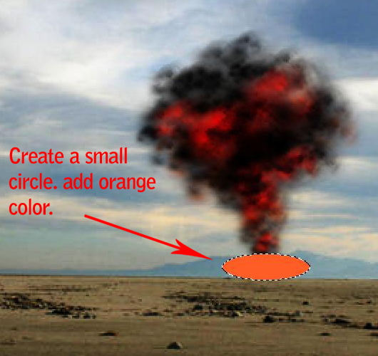
Go to Filter > Gaussian Blur and use 25 as value. Use the image below as reference.

Change the layer mode to Dodge.

STEP 8
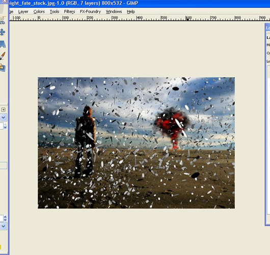
Now I’ll use an image of explosion i got from one of abduzeedo tutorial. You can download it HERE.
Import the image to our document.
STEP 9
Reduce its size. Make the explosion.png little bit smaller.

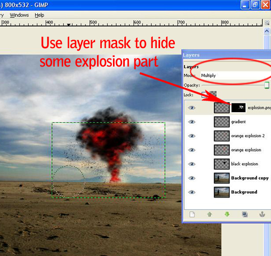
Change the explosion.png layer mode to multiply. Add layer mask to it. Use mask to hide some part of the explosion image.
Reduce the opacity of the layer to 50%
STEP 10
This is the fun part for me. I’ll add some fireball effect. Start painting the fireball with black color. Use the image below as reference.
(We will use the same technique from step 4 to step 6)

STEP 11
Now create another layer and select orange (#ff5d25) for the color.Change the layer mode of this layer to Multiply and paint over the fireball.

STEP 12
Let’s add another layer, keep the orange (#ff5d25) for the color and paint over the other fireball again.
This time however, change the layer mode of the layer to Dodge.
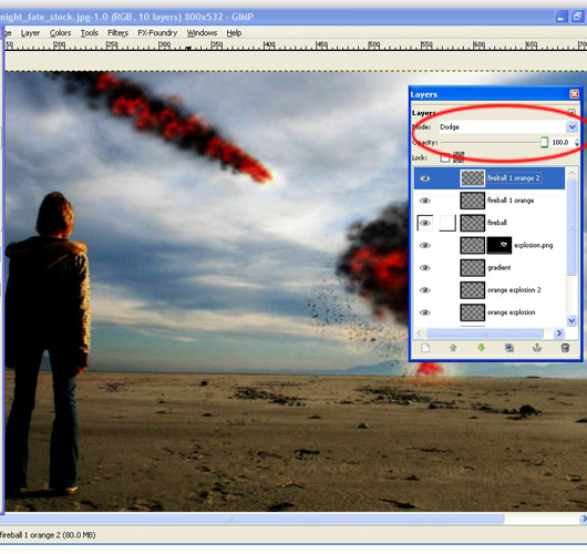
STEP 13
Create a new layer. Change the layer mode to dodge and paint some yellow (#efe219) to create a realistic flame effect.

STEP 14
Try to create another fireball.Use the same process from the previous steps.

ADDING TEXTURE TO DESIGN
STEP 15
Let’s add some textures to our design. I used a photo of a concrette wall, I really don’t remember where I got that image, but you can find good ones at Texturebits or Lost and Taken or Bittbox.
They have awesome and high quality free texture.

STEP 16
Now, change the layer mode to burn and low the opacity to 50%

STEP 17
Add another layer, this time in front of all the other layers. With the Blend Tool fill the layer with a gradient from Yellow to Black.

Then just change the layer mode to Overlay.

STEP 19
I’ll add lightning effect into the image. To do this,create a new layer,above all the layer, fill our layer with black color, then go to Filters > Light and Shadows> Lighting effects.
Use image below as reference.

Change the layer mode to Overlay and low the opacity to 85.

STEP 20
Now we are coming close to the end result.I want to add more sephia color tone to the image. Create a new layer, above all the layer and fill it with orange color(#ff5d25).
Change the layer mode to Overlay

MAKING THE IMAGE DARKER
STEP 21
Now this step is completely optional and depends only on your opinion. I chose to make this image more darker.
You might ask why? This is a matter of personal preference and experience. I think this tone makes this image just looks better.
However, the choice of scale depends on your idea. Sometimes changing a pieces tone can bring out details you didn’t see before and achieve better all around balance, and sometimes it can completely mess up the image.
It is all up to you.
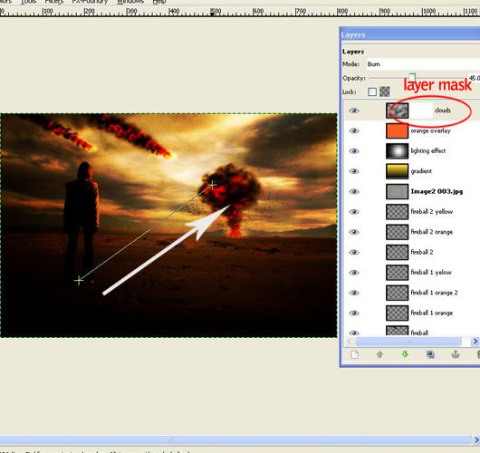
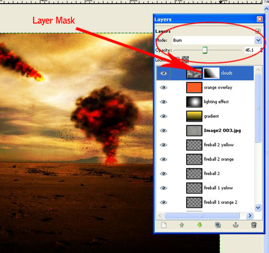
Now,create a new layer and i named it as Clouds.Fill it with white. Go to Render>Clouds>Different Clouds.and apply to the layer. I use 4 for the Detail.


Change the layer mode to Burn and low the opacity to 45%.
Now for final adjustments, add layer mask to our clouds layer

Select black color for foreground and use gradient FG to transparent at the layer mask. Use the gradient to hide some area.
Final Result
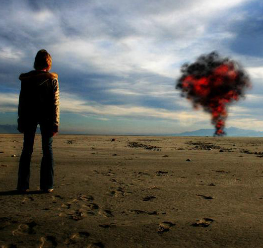
You can view the final image below or view a larger version here.


