Finally I have managed to put my self together and create another blog template tutorial! Sorry to all those who were counting on it before,i just didn’t have the time for it but anyway here it is. so enjoy!
Getting Started
Creating this template is very easy, it just needs some patience and a little effort, so what ever you do. don’t give up.Here is the outcome of this tutorial.

Hopefully a member of the forum will help out in coding this template to a working wordpress theme, so keep an eye out for it :).
Updated
The theme has been converted a wordpress theme to see a live demo or download click here
Before we jump into this gimp tutorial ill need to remind you that i will only go into details of how to do cretin techniques once and then ill just describe it briefly when ever its repeated so pay attention.
Step 1:
Create a New image at 1024X900 and fill the background image with the color 3f3534 adjusting the zoom rate to %50 as i did might to help you compare your progress with mine.
First thing will do is create the content box’s transparent border. this effect is easy and gives a nice touch to the design.
Step 2:
Make sure you have the “Tools option dialog” on your screen,
then start off by Grabbing the “Rectangle Select tool” now draw a Rectangle at any size and in the “Tool option dialog” adjust the position to 98 and 150 and size to 590×695.

If you did that right you should have something like this.

Step 3:
While the selection is still active, in the “Tool Options” dialog Tick the Rounded Corner Box and change the Radius value to 13.7.

Once your done you can click inside your selection to finalise your changes.
Here is how it should look.

Step 4:
Create a new Layer and name it “Border Main content box”, now fill your selection with Solid White. then change the Opacity to 50.

Now that we have the border set we can create the actual base of the content box with a few simple steps.
Step 5:
Right click on your image and the then go to Select > Shrink. now change it to 5 then press OK, below in the example image is how your selection should look by now.

Step 6:
As in step 4 Create a new Layer name it “Main Content box” and fill the selection with Solid White. you can un-select everything by going to Select> None. *Tip make sure the Transparent layer is Below the “Main content Box” layer.

Now that you know how to create these content box’s with there borders i won’t go through them again instead ill just briefly mention what to name the layers and the values like size,position… etc.
Step 7:
Will start with the search box .
Create a new layer name it :Border Search Box with the rectangle select tool draw a selection and
- change values as the following:
- position:697:150px
- Size: 229x65px.
- Rounded corners: radius to 13.7
- Color Fill:Solid white
- Layer Opacity:50
Make sure you have the selection from the border search box still active,now right click then go to Select>Shrink at 5px.
Create a new layer name it “Search box base” fill with solid white and unselect the layer by going to select>none. this is how yours should look.

Step 8:
Create a new layer name it : menu box border with the rectangle select tool, draw a selection and change values to the following:
- position:698:225px
- Size: 228x360px.
- Rounded corners: radius 13.7
- Fill Color :Solid white
- Layer Opacity:50
Create new layer name it: Menu box Base
with the selection of the menu border layer still active, right click and go to select>Shrink 5px, finally fill with solid white. and unselect it by going select>none

Step 9:
Create a new layer name it : 2nd Menu Border
as we have done a few times now grab the rectangle select tool, draw a selection and change values to the following:
- position:698:594px
- Size: 228x249px.
- Rounded corners: radius 13.7
- Fill Color :Solid white
- Layer Opacity:50
Create new layer name it: 2nd Menu Base
with the selection of the 2nd menu border layer still active, right click and go to select>Shrink 5px, finally fill with solid white. and unselect by going select>none.
You should have something like this by now.

So far we have made all the main components of the website now its time to add some nice brushes to the background.
I used the Floral Brushes set by solenero73 , you can use your own if you wish, the trick is to apply the brushes on each corners but don’t go too out of control with it, the less you use the better.
you can download them from here: Download the floral brushes here.

Step 10:
Once you have downloaded and installed the brushes have your foreground color set to fffe87, Create a new layer and name it “Floral effect” and place the layer just after the background layer.

Now smartly place the brushes around the corners, see my result.

Now its time to create the top menu buttons, depending on how much you intend on having you might want adjust the width, in this gimp tutorial i intend to only have three main buttons.
Step 11:Button/Tabs
You might want to zoom in to 100% to make it easier.
Create a new layer name it : Tab border
grab the rectangle select tool, draw a selection and change values to the following:
position: doesn’t matter right now.
- Size: 140x62px.
- Rounded corners: radius 13.7
- Fill Color :Solid white
- change Layer Opacity to 50
Create a new layer name it: “Tab base” and with the selection of the “tab border” layer still active, right click and go to select>Shrink 5px, finally fill with solid white. and unselect by going select>none.
this is how it should look.

That part was repeated many times but now here comes something different. what we are going to do is merge the two layers that make up the tab button so that we can add some changes to it later on.
Step 12:
To merge the two tab layers you need to hide all the layers we’ve created, except the final two which are the “Tab base” and “Tab Border” layers. to do that simply un click the “EYE” icon shown beside each layer. Your layers dialog should look like this

Step 13:
Once you have that done, right click on the tab base layer and click on “merge Visible Layers” in the Merge Layers window keep it on its default “expanded as necessary” then hit OK.

Step 14:
Now its merged into one image go ahead and change its name to just “Tab” and display all the hidden layers by clicking on the eye icons again.

Before we put the tab into position we want to delete part of the transparent borders on tab so when we overlap the tab above the content box it blends in perfectly. you might want to zoom in to about 200% to make it easier.
Step 15:
Grab the “Eraser tool” then go to the brushes dialog and create new brush with the values set as the following
- Radius:18.6
- spikes:2
- Hardness:1
- Aspect ratio:1
- Angle:0
- Spacing 0
Then name it what ever you like and save it.

Step 16:
Place the tab above content box and using the eraser and brush we created, eraser the overlapping border, you might not get it the first time so keep trying took me 1 min to get it right.

Step 16:
Now duplicate 2 more tabs and space them out evenly as shown in the image below.

Time to create the menu buttons for the category side I’m going to use two colors the blue for mouse overs and the gray for normal status.
Step 17:
Grab our favourite tool the “Rectangle select tool” draw a rectangle and enter these values in the “tool options” dialog.
- Rounded corners: 62.7
- Position 708:253
- Size:206x30px
Once you have the oval shape fill it with the color 36afdc.

Now will duplicate a few more menu button but this time changing the colour to Gray.
Step 18: right click on the menu button and click on “alpha to selection” create a new layer name it “Menu button 2” then fill it with this color a09999

Step 19:
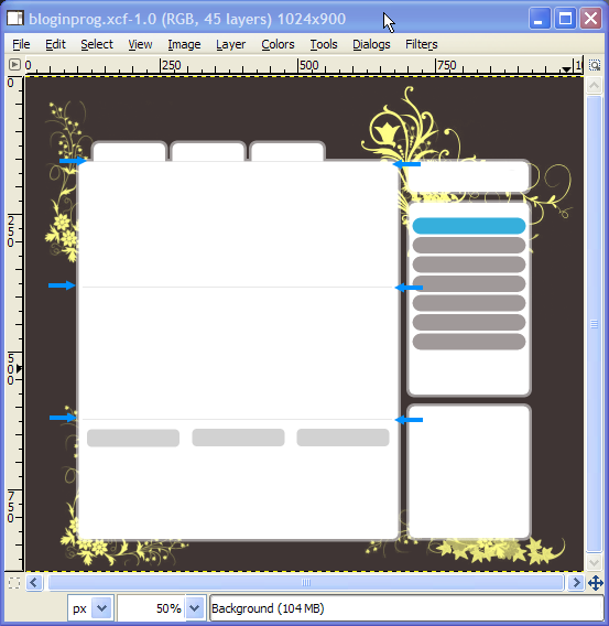
Now duplicate 5 of these menu button name as menu1-menu2 etc. and space them out evenly like as I did in the image below.

Now we need to create three more rounded buttons for the titles of the links that will be placed at the bottom.
Step 20:
Create a rounded rectangle using these values
Create a new layer name it “Bottom content buttons”
- Rounded corners: 5.0
- Position:309:640
- Size: 168x32px
- fill using the color d2d2d2
Duplicate 2 more of them and place them evenly at the bottom of the content box.

Now we will create content dividers that will go between each post.
Step 21:
Grab the selection tool and draw a 563x1px rectangle which is basically a line, once you have that right, duplicate it twice and place them as i did in the example below (notice the blue arrows).

Step 23:
We should have done this before but anyhow make sure you add another rounded button for the search field with these values.
Create a new layer name it “Bottom content buttons”
- Rounded corners: 5.0
- Position:717:166
- Size: 168x32px
- fill using the color d2d2d2

So far we’re done with the main layout and can now move on to adding icon/content elements which will really make it look good once its done.
we will start with the icons. fist of all i didn’t create these once to save time i instead bought them off istockphoto, its pretty cheap so unless your going to make your own you might shell out a few cents and buy some.
Step 23:
Your going to need a search,RSS, and a Comment icon. now i don’t think i need to explain much here so just look at where i placed mine and do the same. try not to have icons bigger than 32×32.except for the RSS icon see what matches. here is what i picked off istockphoto

You can see my placements in this example.

Now for the content. its probably the hardest part when starting from scratch, laying out content is key to great design, you can have a perfect design but if you don’t place content in just the right place and style it can ruin everything. so pay attention to where i placed mine and notice how i try my best to keep white space equally on the sides all the time.
Since all i did was add text ill try to give a few pointers for when you apply your own content.
- Images in post should be consistent i gave my self around 128×128.
- I used the font “Trebuchet MS Bold” for everything except the right category buttons, i used “Verdana Bold”
here are all the colors i used for text.
- Headers, Blue”36afdc”
- post text, light brown “939191”
- bottom lists, medium brown “5f5b5b”
- Dates in post, “d2d2d2”
- Comments count, “3f3534”
So that’s it! there you have a great blog theme design created in gimp. you might want to modify colors and other elements to suite your taste.

The gimp XCF source file is attached at the bottom of the tutorial.and one last work give credit where its dew. This design has already been converted to a wordpress theme and can be downloaded from her.
